Print for Masterplan.com
Newspaper campaigns, posters in client offices and a calendar that sits on their desks all year.
Sector:
B2B e-learning
Scope:
Press ads, Posters, Roll-ups, Calendar, Print production
Masterplan.com is an e-learning platform that lives mostly on screen. But part of its communication goes to print: newspapers, client office walls, events and desks. I designed these materials in InDesign and Illustrator, prepared the print files and oversaw production with the printers.

Press campaigns
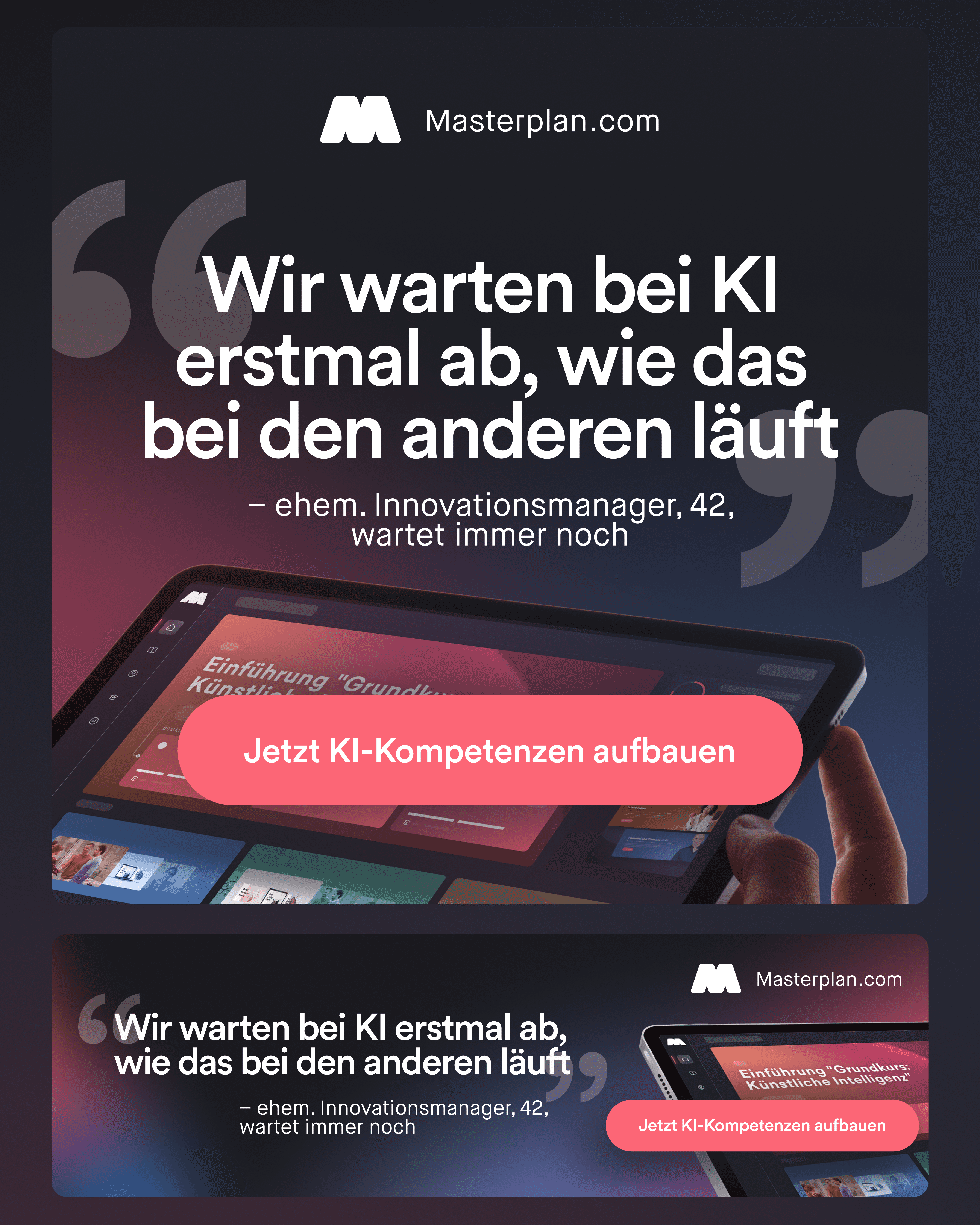
I designed ads for Handelsblatt and Tagesspiegel in different formats, from upright ads to horizontal strips, the largest a quarter page. In a newspaper an ad sits next to other ads and articles, so each one has a short headline that stops the eye and a clear call to action with the website. They all share the same elements: a dark background, a pink handwritten accent and a shot of the platform, so together they read as one campaign.



Posters and roll-ups
I carried the same style onto larger formats. The A3 posters for the “Aus To-do wird Tadaaa!” campaign were made for clients such as Kärcher and LBBW, with their logos, and hung in their offices, also in an English version. Plus a large-format piece for the offices, with a quote in a handwritten-note style, and event roll-ups where the key message reads from several metres away.


Calendar for clients
For clients, I designed the “Masterplaner 2026” desk calendar on a wooden stand: a cover and 12 cards, one for each month. Each card has a different short learning tip with a simple graphic, a QR code and the month’s calendar. That way the brand stays on the client’s desk all year and says something new every month.


The outcome
Masterplan showed up where clients read, work and meet: in business newspapers, in offices, at events and on their desks. Every piece followed the same identity as the digital materials, so the brand looked consistent across every format. I prepared all print files myself, from CMYK and bleed to publisher and printer requirements.


